Wednesday, August 30, 2017

Awful Hurricane Inspires Cartographic Greatness

At the risk of minimizing an awful tragedy, Hurricane Harvey has inspired some wonderful maps, particularly from the New York Times and Washington Post. This animation from the Times is spectacular. Click the play button and watch it unfold.
The subtle dark circles indicating areas of peak rainfall create a remarkable sense of the storm's movement.

The Washington Post's cube showing the total rainfall is also pretty remarkable.
https://www.washingtonpost.com/news/capital-weather-gang/wp/2017/08/27/texas-flood-disaster-harvey-has-unloaded-9-trillion-tons-of-water/?tid=graphics-story&utm_term=.c92fead7bb78
This only shows what rain had fallen as of August 27th so the situation has gotten much worse. In fact, here is an animation they just put on Twitter.
They did a nice job highlighting buildings and areas on the background map.

The total rainfall map is also quite striking. I lost the text on the image below but you almost don't need it. You can see the entire map with city labels, precipitation totals, legends and all by clicking on the picture.
https://www.washingtonpost.com/graphics/2017/national/harvey-impact/?utm_term=.59c3b4a0ab9d
Their map of rain gauges is also excellent.The arrows almost give it a three dimensional effect.
https://www.washingtonpost.com/graphics/2017/national/harvey-houston-flooding/?utm_term=.1266d16af560
I tried to break out of the New York/Washington media to see what other maps are out there but these really are much better than anything else I've seen. The Houston Chronicle has little to offer for maps though they do have an impressive collection of photos of the devastation and rescue efforts. What is encouraging is to see many articles about cooking, sports and politics showing that life is getting back to normal for at least some people in the area.

Wednesday, August 23, 2017

Eclipse Map Follow Up

Before Monday's eclipse I posted some excellent maps and visualizations of it. Here are a few I missed and some post-eclipse maps.

The Washington Post made a great graphic showing the most liked images tagged #eclipse2017 on Instagram.
https://www.washingtonpost.com/graphics/2017/national/health-science/eclipse-2017-instagram/?%3Ftid%3D=sm_pg&utm_term=.5d816ca789ba

Hover over each image for more detail
Even filtering for the eclipse tag, not every image is eclipse-related.
The Post also posted this widely-circulated map showing how Google search results for the eclipse followed the path. I like the color choices!
https://img.washingtonpost.com/blogs/wonkblog/files/2017/08/eclipse.png
From the same article, an understated graphic showing what the eclipse looked like throughout the United States.
https://img.washingtonpost.com/blogs/wonkblog/files/2017/08/Screen-Shot-2017-08-01-at-10.26.41-AM.png
The Canadian Space Agency has a similar map showing what the peak eclipse looked like over their major cities. Though there was not a total eclipse anywhere in Canada, the map does give an easily understandable view of what will be visible. The green-blue gradient is a little gratuitous but I like this map a lot.
http://www.asc-csa.gc.ca/images/recherche/tiles/64bd3e42-f01a-4071-b404-35202a1cc0aa.jpg
This gif, an animated satellite view popped up somewhere is the social media world-I forgot where I found it. Click the image for a larger view and some animation options.
https://gfycat.com/confusedpopulardutchsmoushond
Finally I made my own screen shot that got popular (by my standards) on Twitter showing the path of the eclipse via Google Traffic.
https://twitter.com/MapOfTheWeek/status/899729626137755648
Before the eclipse the only thing that stood out was a huge amount of traffic converging on South Carolina from the Atlanta and Charlotte areas. Otherwise there wasn't much else to see. When I looked shortly after the peak of the eclipse the pattern became pretty clear.

Wednesday, August 16, 2017

Tramways of Portland, Maine

I found some great old maps of the tramway system of Portland, Maine on a German Wikipedia page. Interestingly, there does not appear to be an English-language version of this page.
https://upload.wikimedia.org/wikipedia/commons/thumb/9/97/Portland%2C_Maine_-_Map_of_the_Horse_Rail_Lines_1876.jpg/1920px-Portland%2C_Maine_-_Map_of_the_Horse_Rail_Lines_1876.jpg

The city began a horse-drawn tramway in 1863. The image above highlights the tramways in yellow over a panoramic image from 1876. The details in this panorama are spectacular.

The map below shows the growth of the horse tram system from 1883 to 1896
https://upload.wikimedia.org/wikipedia/commons/f/fe/Portland%2C_Maine_-_Map_of_the_Horse_Rail_Lines_1883-1896.jpg
The Portland and Forest Avenue Railroad Company was founded in 1860 and began operating a horse drawn carriage system. The first section ran between Spring Street and the Grand Trunk Railway Station (shown in the panorama detail) opened in October, 1863. The fare for the entire route was 5 cents. The following year two more lines were added. The red lines shown above represent the system by the end of 1864.

The author,  Maximilian Dörrbecker traced the tram lines over a US Geological Survey map from 1916.

The lines were electrified starting in 1891. Over the next two decades the system expanded far into the suburbs.
https://upload.wikimedia.org/wikipedia/commons/c/c3/Portland%2C_Maine_-_Map_of_the_Electric_Railway_Lines_1891-1914.jpg
 A detail on the lower left side gives a good view of the extent of the system by 1902. Not shown are extensions to Lewiston, Falmouth, Saco and Old Orchard Beach.
Here is a bird's eye view from 1909.
https://upload.wikimedia.org/wikipedia/commons/thumb/c/c9/Portland%2C_Maine_-_Map_of_the_Rail_Road_System_1909.png/800px-Portland%2C_Maine_-_Map_of_the_Rail_Road_System_1909.png
Again the beauty is in the details.
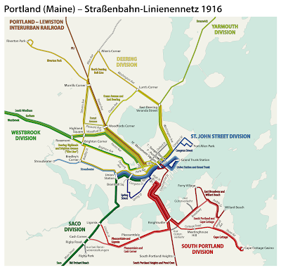
Here is a subway style map showing the lines at the system's peak in 1916.
https://upload.wikimedia.org/wikipedia/commons/e/ec/Portland%2C_Maine_-_Electric_railways_route_map_1916.png

After World War I the system began to decline. The suburban lines were abandoned in the early 1930's and by 1941 the entire system had been replaced by buses.

Wednesday, August 9, 2017

The Guardian Building Mural

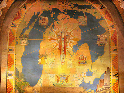
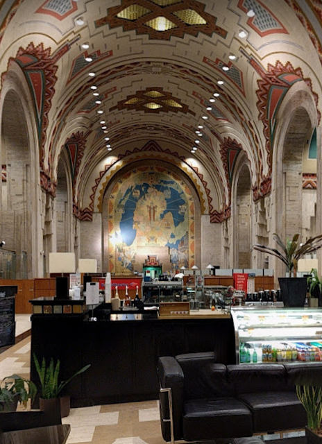
Next time I visit Detroit the Guardian Building, an art deco "cathedral of finance" will be on my must see list. Not because it is a "timeless depiction of creativity and accomplishment" but because of the Michigan map mural. Just look at how it's situated! It's like the Cathedral of the Holy Map!
https://www.flickr.com/photos/amberwillits/26418884725/
The map on its own does not show much - mainly colored counties and water bodies along with various figures and coats of arms. If you're a Michigan purist you will note that most of the Upper Peninsula is missing. Its more about how the map is displayed.
https://www.flickr.com/photos/zxgirl/6464055379/
Here I have zoomed in a bit for better detail
https://www.flickr.com/photos/zxgirl/6464055379/
The above pictures are from this page on flickriver but you can also go inside the lobby on Google StreetView.
https://www.google.com/maps/@42.32956,-83.045978,3a,75y,156.89h,90.99t/data=!3m8!1e1!3m6!1sAF1QipNBHFcqNNfQPgDpGmxahv14IvZqy6GAIAScFYET!2e10!3e11!6shttps:%2F%2Flh5.googleusercontent.com%2Fp%2FAF1QipNBHFcqNNfQPgDpGmxahv14IvZqy6GAIAScFYET%3Dw203-h100-k-no-pi-0-ya223.32114-ro0-fo100!7i7168!8i3584
You can also see some great art deco details from the links above including a Tiffany glass clock, a stained glass Native American mosaic, light fixtures and even details around the elevator doors.

Wednesday, August 2, 2017

Where to See the Best Eclipse Maps

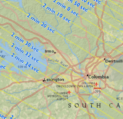
It's not about where to go to see the upcoming eclipse (August 21st, 2017) -it's where do you see the best maps that interests me. The Great American Eclipse site is a good starting point. They feature very detailed maps showing how much time the total eclipse will last.
https://static1.squarespace.com/static/53c358b6e4b01b8adb4d5870/53eee705e4b0b80451132d74/53eee74be4b0880c7d4f6c09/1408166076430/SouthCarolina_Central.jpg?format=1500w
Above is the area around Columbia, South Carolina where some friends of mine (and possibly me but that is unlikely at this point) are gathering. I'm not sure why they want to drive 30 miles to get an additional 10 seconds of eclipse time but maybe it's better watching it over Lake Murray. Hopefully they get a sunny day-chances are much better of that in Nebraska or Wyoming.

This site features maps of the nation, for each state, drive time maps, videos of the path, lots of highly detailed maps like above and statistics. You can also buy "Occupy Totality" T-shirts. I like their logo too.
Here is a simple nationwide map from the South Carolina State Museum via the Columbia Total Eclipse Weekend site.
http://totaleclipsecolumbiasc.com/wp-content/uploads/2017/04/solar-eclipse-map-2017.jpg.png
The Washington Post has a great page where you can scroll down and follow the eclipse's path. Here are two screen shots of Oregon.
 Also Carhenge, because Carhenge is awesome.
Teams of students under the Eclipse Ballooning Project will be sending up high altitude balloons with cameras across the country to live stream the event. You will be able to watch here.
Rexburg online (Idaho) has a nice simple state map.

You can see where future eclipses will be from Scientific American. Their interactive graphic works nicely for small countries...
...but gets unwieldy for larger ones.
There are probably many other good graphics. You can look up at the sky or look online for more maps. If you are in the USA and you miss this one, there will be another one in seven years. Click the picture for more details.
https://www.greatamericaneclipse.com/april-8-2024/