Last week I visited the
Osher Map Library where
The Golden Age of American Pictorial Maps runs through September 3rd. I did a very short
blog post. Now that I have more time here are some more detailed highlights. Most of the exhibit's maps can be seen and zoomed into online at
this link. I took my own pictures to give a detailed look at parts of the maps and also to make the text more readable
The "Golden Age" of American pictorial maps is defined as the 1920's-1960's, a time when maps were part of and a reflection of the popular culture. There are seven parts to the exhibit - I will try and show highlights from each in order.
1. Early Pictorial Maps
The
first map in the collection is actually not from this time period - it is from a 1662 Joan Blaeu world atlas. The point is to illustrate an early version of a map with many pictorial elements.
After touring the exhibit, I got a chance to hold a volume of this atlas in my hands. The atlas is full of great details that I hope to revisit in a future post.
George Walker & Co., Bird's Eye View from Summit Mt. Washington (ca. 1905)
This is a spectacular art/map combination. Here's a picture I took of the summit.
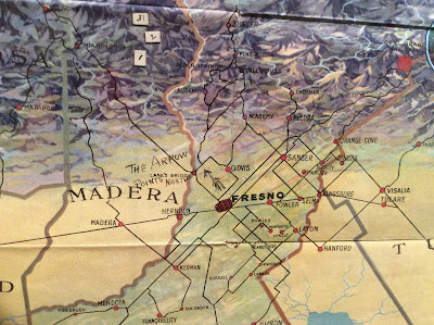
Fresno County and Mid-California's "Garden of the Sun" (author anonymous) is another one of my favorites:
Also in this section is the
London Wonderground Map that was the subject of a
previous Map of the Week post.
2. Maps of Place and Region
Ilonka Karasz, Plan de Paris (1927)
Of course I love Paris but I also love the way the streets have hatch lines that make it look like they were stitched onto the map.
Carl Crow and V. V. Kovalsky Illustrated Historical Map of Shanghai (1935)
I liked the title block so I photographed it.
3. Maps to Instruct
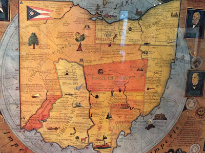
Arthur B. Suchy Ohio, Mother of Presidents (1939)
The regions are interesting and new to me-lots of good small details too.
Emma Bourne, America-A Nation of One People From Many Countries (1940)
This was published by the Council Against Intolerance in America to show how well immigrants have been integrated into society. "With the exception of the Indian all Americans or their forefathers came here from other countries." While I was at this exhibit, Donald Trump was across town trying to blame Maine's Somali immigrants for an imaginary rise in crime.
Edward Everett Henry, The Virginian (1960)
a remarkably detailed map illustrating the first "western" novel.
4. Maps to Amuse
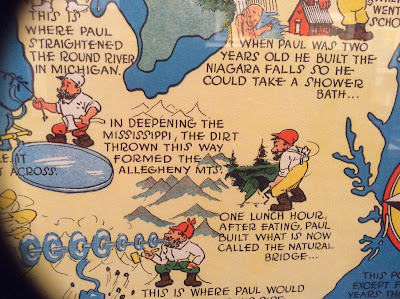
Ray Handy's
Paul Bunyan map is some good, ridiculous fun.
Also, similar to my old
Texan's map postcard is this
Angeleno-centric "brag map"- proudly showing off local geographic ignorance. Chicago is a state but Wisconsin a mere city within Minnesota. States are placed in ridiculous locations with a giant Iowa in the middle and phony places like "Feudville" in Kentucky.
5. Maps for Industry
Cleveland Terminal Group, The Capital of a New Trade Empire (1929)
Civic pride on steroids! I chose this one because my wife could find the intersection where she once lived on the map-it's right there in the lower right - see it?
Map of Michigan (Slightly Exaggerated) Shafer's Bakeries, Inc. (1949)
Similar to the LA "brag map" but also advertising bread ("such crust!") and using loaves as border decorations. Nice references to Florida as "Southern Michigan," California as "Western Michigan" and Chicago as the "Gateway to Michigan."
6. Maps for War.
Ernest Dudley Chase, Japan, The Target: A Pictorial Jap Map (1943)
World War 2 in the North Sea Area...(1944)
This one was in a big glass display in the center of the room. As a result I was not able to get a picture without lots of reflections so use
the link to see it better.
7. Maps for Postwar America.
There are lots of good maps in this collection, but I like this juxtaposition of an optimistic
map of New York from 1958 followed by a gloomy
view of LA from a decade later. The LA view features pink sky, smog and a sickly sun.
Nils Hansell, Wonders of New York (ca 1958)
Gene Holtan, Los Angeles (1968)
One final note: The staff at the Osher Library were extremely welcoming and helpful. Mr. Osher even dropped in to see what I was doing. I would like to thank them for all their help - and the lunch recommendation!
 The above map via WDET, was originally featured in a 1972 travel magazine. There are some nice pictorial elements but unlike many pictorial maps, the accuracy does not suffer from these details. The radio station's CuriosiD page includes this map along with stories, audio and an interactive map showing the movement of gay culture since 1930.