Women in Cartography is an excellent exhibition at the Boston Public Library. It runs until March 27th. If you don't get a chance to visit in person you can view the exhibition online here. In December I got a chance to see it. Here are some of the highlights.
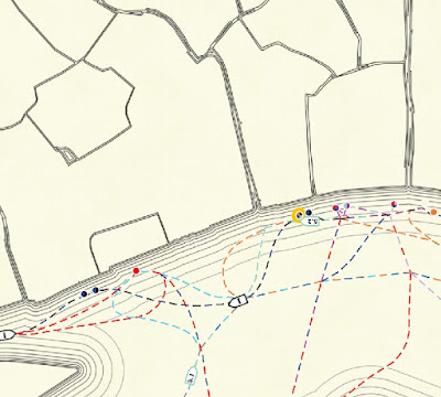
Physiographic Diagram of the Western Pacific Ocean - Marie Tharp and Bruce Heezen, 1971
Geologist/Cartographer Marie Tharp created the first map of the ocean floor. Originally this map was credited solely to Heezen, her research partner. It is displayed on the floor. Here is a picture I took looking down.
 The numbers indicate depths of the sea bottom and height of undersea mountains. The colored areas are land, in this case the Hawaiian Islands rising from the depths of the Pacific.
Mappemonde Projetée sur l’Horizon d’Angers - Céleste Babin, 1839
This double hemisphere map was done by a student in Angers, France. The left hemisphere is centered on Angers and the right one on its antipode (opposite side of the earth.)
 The detail below shows off some nice hand calligraphy and a view from Angers.
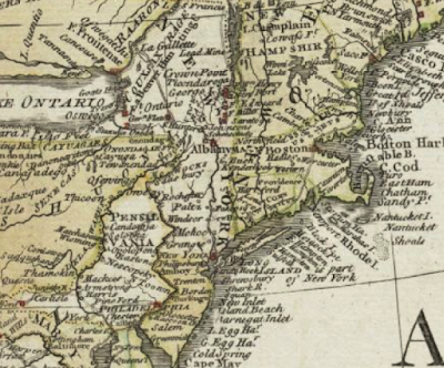
 A General Map of North America … - Mary Ann Rocque, 1761
Rocque carried on her husband's business after his death. This map was credited to "M.A. Rocque" obscuring (possibly intentionally) that it was produced by a woman.
A New Map of ye Seat of War in Italy - Ann Lea and Robert Morden, 1701
Ann Lea also took over her husband's map business after his death. The map shows areas of northern Italy that were fought over between France and the Austrian Empire before Italian unification.

“Nationalities Map No. 1,” from Hull-House Maps and Papers … - Agnes Sinclair Holbrook, 1895
 Hull House was a settlement house for female immigrants in Chicago. Holbrook, a house resident designed the map based on Charles Booth's income maps of London (previously mentioned in this post about my visit to Chicago's Newberry Library.) Other house residents helped her gather data for the neighborhood.
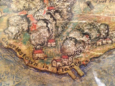
 The Attack on Bunker Hill in the Peninsula of Charlestown the 17th of June 1775 - Mildred Giddings Burrage, 1926
Burrage was a Maine-based artist. She created this map/scene using layers of Gesso to build up a sense of topography.
The exhibit concludes with a technology section including the following maps.
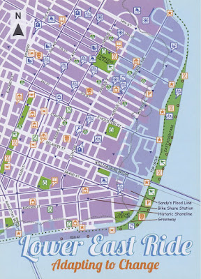
Lower East Ride: Adapting to Change - Maryam Khabazi, Designer, 2013
Created by Green Map NYC, this map highlights the impact of climate change and natural disasters such as Superstorm Sandy and shows resources to reduce energy consumption.
Making History - GIS and Women - Linda Loubert, PhD - 2014-
Dr. Loubert built this crowd-sourced webmap to document thousands of women working in the field of GIS.
 You can see the entire online map here or by clicking the image above. I know some of these people! GIS women rock!
Physiographic Diagram of the Western Pacific Ocean - Marie Tharp and Bruce Heezen, 1971
Geologist/Cartographer Marie Tharp created the first map of the ocean floor. Originally this map was credited solely to Heezen, her research partner. It is displayed on the floor. Here is a picture I took looking down.

Mappemonde Projetée sur l’Horizon d’Angers - Céleste Babin, 1839
This double hemisphere map was done by a student in Angers, France. The left hemisphere is centered on Angers and the right one on its antipode (opposite side of the earth.)

Rocque carried on her husband's business after his death. This map was credited to "M.A. Rocque" obscuring (possibly intentionally) that it was produced by a woman.
A New Map of ye Seat of War in Italy - Ann Lea and Robert Morden, 1701
Ann Lea also took over her husband's map business after his death. The map shows areas of northern Italy that were fought over between France and the Austrian Empire before Italian unification.
“Nationalities Map No. 1,” from Hull-House Maps and Papers … - Agnes Sinclair Holbrook, 1895

Burrage was a Maine-based artist. She created this map/scene using layers of Gesso to build up a sense of topography.
The exhibit concludes with a technology section including the following maps.
Lower East Ride: Adapting to Change - Maryam Khabazi, Designer, 2013
Created by Green Map NYC, this map highlights the impact of climate change and natural disasters such as Superstorm Sandy and shows resources to reduce energy consumption.
Making History - GIS and Women - Linda Loubert, PhD - 2014-
Dr. Loubert built this crowd-sourced webmap to document thousands of women working in the field of GIS.