Wednesday, July 29, 2015

The Bombing of Laos

The United States and its allies dropped over two million tons of bombs on Laos during the Vietnam War. That's a ton for every citizen of the country (at the time) and equal to a planeload every 8 minutes for 9 years. National Geographic's August issue has a great article and map of the bombing sites.
http://ngm.nationalgeographic.com/2015/08/laos/bombs-map
 Bombings were concentrated on the Plain of Jars in the north and the Hi Chi Minh Trail in the south, a supply route between North and South Vietnam. Here is a detail showing the Plain of Jars.
http://ngm.nationalgeographic.com/2015/08/laos/bombs-map
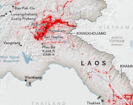
 The interactive map has a time slider so you can see the numbers grow over the war period (1964-1973) The article discusses the opportunities and hazards all this scrap metal presents. An unknown, but very high percentage of these bombs did not explode on impact and are still out there, waiting to explode. In 2012 15 Laotians were killed and another 41 injured by live ordnance. The U.S. government has put a relatively small amount of money towards the removal of unexploded ordnance. Laos could use some more help cleaning up after us.

For more information see National Geographic.
If you click on the interactive map, you can download the text overlay image which gives you a map of Laos in isolation - no bombs, no neighbors.
http://ngm.nationalgeographic.com/2015/08/laos/img/laos_textoverlay2.png


Wednesday, July 22, 2015

Soviet Military Maps

A recent article in Wired details how some western map enthusiasts got a hold of thousands of military maps from the disintegrating Soviet Union. These maps are very detailed and accurate, often showing features not seen on government maps such as those from the USGS or Britain's Ordinance Survey. They are also beautiful and somewhat creepy.
Golden Gate Park, San Francisco
There are obvious military uses such as describing the materials and carrying capacity of bridges, military installations, and the spacing of trees in forests...
The Pentagon
San Diego naval facilities compared with the less detailed USGS map (right)
...but they also show factories, piers, bus stops and residential subdivisions. The article extensively interviews John Davies who is working on a book about Soviet military mapping. He suspects that they are more for the purposes of occupation than for an actual invasion. There may have also been an interest in  studying the economic systems of the countries through urban layouts. Davies has an impressive website, full of examples of these maps. Below are some images from his pages.
http://images.jomidav.com/worldmapsh35_003.jpg
Maps come in various scales from worldwide at 1:2,500,000, to very detailed 1:10,000-scale city plans. I prefer to focus on the larger-scale maps for their level of detail.
Manchester, UK


This is a detail of the Boston map showing the Diamond Middle School in Lexington, Massachusetts. I wonder if Davies included this to add some drama. They mapped the whole area but focusing a school lends a creepy "they're coming for my kids!" aspect to it.
http://images.jomidav.com/SovietMaps/B3.pdf
I often ride my bicycle through this school-next time I'll look out for spy planes!


Wednesday, July 15, 2015

Secret Map of the Battle of Balikpapan

Seventy years ago the Battle of Balikpapan (July 1-21, 1945) was ongoing. This was the concluding stage of the Borneo campaign that removed the Japanese from the island and one of the last battles of World War II. It was mostly fought by Australian troops, but there were also US troops involved, including my wife's Uncle. He gave me some maps and diagrams from the war, including this remarkably detailed map.
Hopefully by now it is safe to show details of a secret map.
This Dutch topographic map was annotated by the Australian Army Topo Survey. The annotations (in red) show enemy positions, trenches, tunnel entrances, bunkers, landing obstacles and observation towers.
The legend shows the range of details that were annotated
Balikpapan was and still is an important oil producing center. Destroyed oil tanks are X-ed out in red.
Folded into the map was an invasion diagram for Green Beach. His name (Lt. Garfinkle) appears twice - on the second wave and also in the bottom right corner (I'm not sure what that area of the diagram means.)
Green Beach was annotated over the map. I suspect it was only given that name for the purpose of this invasion. There is also mention of a "yellow beach" though it is not shown on the map.
 The area was heavily booby-trapped with mines and submerged logs tied together with wires. Landing craft could only approach after heavy aerial bombardment and mine sweeping. The LVT's mentioned on the diagram are amphibious tanks.

There is a very detailed description of the battle on Digger History, an unofficial history of the Australian and New Zealand Armed Services. Most of the places mentioned on the first part of that page can be found on the map so it's been interesting to read it with the map open.

After the beach and highway were secured the troops needed to disable antiaircraft positions and capture the nearby ridge so that Japanese snipers would no longer have a high place to shoot from. Hill 87 at the bottom of the ridge was a fortress of trenches and tunnels.
When this area was finally secured, they moved on to capture Newcastle (Hill 99 on the right edge of the map below.) This high area overlooks the town and harbor of Balikpapan and was a good location to launch an attack on the town. 

I did not get a chance to talk to my Uncle-in-law about his role in this battle while he was still alive so unfortunately all I know is from his placements on the diagram.

Wednesday, July 8, 2015

The Continental Poverty Divide

This map is a bit old (1999) but shows some interesting patterns in wealth and poverty. It is part of the Centers for Disease Control's Maps That Make a Difference series. Among other things, it highlights a north/south "continental* poverty divide."
http://www.cdc.gov/dhdsp/maps/gisx/mapgallery/Concentrated_Poverty.html

The map also highlights outlier counties-places in the south with lower levels of poverty and in the north with higher levels. Outliers in the south mostly seem to be around large cities, mostly in the suburban counties. There are clear rings around Dallas, Atlanta and Nashville.

Northern outliers are more diverse. The most clear ones are the counties with Indian Reservations but there also seem to be concentrations in counties with colleges and military bases. Also, some of the larger cities show up such as Detroit, Milwaukee, Philadelphia and Baltimore. Partially this is a result of these cities being either independent counties, or taking up most of the county with much of their wealth concentrated in the adjacent suburban counties.

*It is US-centric to refer to this as a "continental" divide but given the demographics of Canada, Mexico and Central America, this may very well be an accurate description.


Wednesday, July 1, 2015

10 More Maps That Won't Change Your Anything!

They just keep coming! A constant stream of clickbait about how a series of maps will change your life, make you think differently, increase your earnings, and help you finally get that promotion. OK, perhaps the latest version is a bit more modest seeking only to "teach you something new about the world" - though the merit of knowing how to say "bear" in different European languages is debatable.

Here we attempt to free you from the burden of such claims. Like a good summer read, here are some maps that are unlikely to change your life but you may enjoy them just the same.
  
1. Map of the Detroit area on a Motown single
2. Map from a menu of the Brown Derby, Los Angeles via The New Yorker
http://www.newyorker.com/culture/culture-desk/chronicling-los-angeles-history-menu-by-menu
3. Map of Heisenberg - a fictional city based on Breaking Bad
http://akidwell72.wix.com/visitheisenberg
4.  Map of Albuquerque - an actual city based on Breaking Bad
http://tomlambmaps.tumblr.com/post/113535321000/breaking-bad-map-by-tom-lamb-in-albuquerque-nm
5. Historic map of the Black Swamp - from a Toledo Bellows article about the Black Swamp Underground, a Toledo area musicians' collective.
6. Tourist map of the Hague by Zara Picken.
http://zaraillustrates.tumblr.com/post/47696751349/i-was-commissioned-by-homes-antiques-magazine-to
7. Manitou Springs, Colorado where I had an excellent breakfast once. From the Colorado Springs Gazette, 1922.

8. The Beatles Map, 1974. Click the image for a more legible version.
 http://www.theguardian.com/books/gallery/2014/nov/04/a-history-of-the-20th-century-in-100-maps-in-pictures#img-8
9.  Interactive map of El Gouna, Egypt.
10. Online map from the Golden Gate National Parks Conservancy