Wednesday, February 25, 2015

A Trucker's Odyssey

Bloomberg Business reporter Jennifer Oldham accompanied Tracy Livingston, a long-haul trucker on a six day journey involving two round trips between Michigan and Tennessee. The article provides a good, empathetic picture of the trucking life. They did an excellent job of mapping the journey.
http://www.bloomberg.com/infographics/2014-12-17/truckers-odyssey-six-days-on-the-road.html
You can click above for better resolution. Here is a detailed section.
The route is color coded by day. Icons are used to represent stops for gas, food, caffeine (a necessity when working 14 hour days) and various other needed diversions. These icons use the same colors for each day and add some personality to the map.

Wednesday, February 18, 2015

The World's Megacities

The Economist has a bubbly interactive map/video of the world's megacities (those with a population of 10 million or more) from 1950 to 2030. According to these population figures, from the United Nations, nearly 9% of the world's population will be living in 41 megacities by 2030. The video is a bit slow because it cycles through every year for the 80 year time period. Here are some stills from now, then and the future.
Megacities are shown as red proportional circles. In 1950 (above) there were only two megacities, New York and Tokyo. Today (2015) there are numerous megacities, mostly in Asia. 
By 2030 the most noticeable growth of cities will be in Africa.
The UN data are usually for metropolitan areas, including suburbs, but some of the populations are listed for the "city proper." These inconsistent figures provide good ammunition for the complain-y comments at the bottom of the page. 

You can search a city or click on one for a graph showing that city's population curve.The vertical line indicates the chosen year, in this case 2014.
Beware of the constantly changing y-axis when comparing cities.
You can also click the legend at the top to turn on or off size categories of cities. So if you want to only see the megacities of 2015, you get this.
The UN has its own version of these maps. They're not as flashy but they shade the countries by percentage of urban population which is a nice touch.
The smaller circle sizes create less drama but the map still effectively tells the same story.

Wednesday, February 11, 2015

History of Basketball in New York City

In honor of the NBA All-Star Game being held in New York (love the subway-inspired logo) the NBA has created a very ambitious map showing the city's important people and places.

http://www.nba.com/nycbasketball/?ls=nba:specialsfull4
The map is interactive in that you can choose a borough, get a list of places and people and be zoomed to the appropriate location. However, it refreshingly avoids the typical pushpins and pop-ups that come with an interactive map, going instead for a poster look.
http://www.nba.com/nycbasketball/?ls=nba:specialsfull4
To fit everything into the correct geographic locations some crazy things happen. In the above image Erasmus Hall High School has an inset map down at the bottom, below Coney Island. A dashed line connects it up to its actual location in central Brooklyn. Various alumnae are connected to the inset via solid orange lines-these are color coded by borough. To trace the path of my childhood hero Billy Cunningham, follow the solid orange line down from his picture and bio to the inset map, then back up along the black dashed line through his own graphic to the circle and point in the upper left corner of the above image.
http://www.nba.com/nycbasketball/?ls=nba:specialsfull4
Some of the most interesting stories are about the humble playgrounds where many of these players got their start - such as the West 4th Street "Cage" as detailed above. They also do a good job of showcasing female athletes such as WNBA star Sue Bird.
http://www.nba.com/nycbasketball/?ls=nba:specialsfull4
Click here to begin. Enjoy browsing and have a happy All-Star weekend!
 

Wednesday, February 4, 2015

Happy 10th Birthday Google Maps!

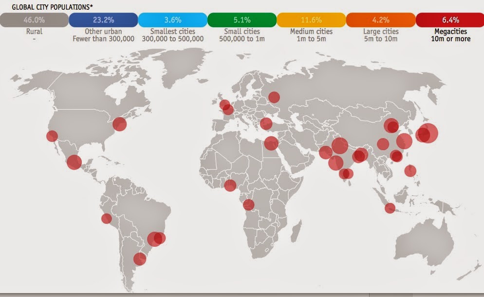
Google Maps has now been at it for ten years! Here is a quote from their first announcement on the Google Blog titled Mapping Your Way, February 8th, 2005.

We think maps can be useful and fun, so we've designed Google Maps to simplify how to get from point A to point B. Say you're looking for "hotels near LAX." With Google Maps you'll see nearby hotels plotted right on a crisp new map (we use new rendering methods to make them easier to read). Click and drag the map to view the adjacent area dynamically - there's no wait for a new image to download.
Shall we try that?
Wow! It works! Still!

I looked for old screenshots of what their product looked like back in 2005 but was not very successful, so these images from old Map of the Week posts will have to do. Here is an image from 2006 from a post about urban food choices in West Philly. If you ignore the points, you can see how Google's Cartography has improved.
I really disliked the early look of Google Maps. The streets were so wide there was little room for any other detail. Also, the road hierarchy was a problem - too many important (yellow) roads makes them all less important. They have improved the look tremendously, changed to a more subtle and readable color scheme and added lots of nice detail-especially when you zoom in a bit more.
For a more zoomed out perspective, here is a map of Sioux City, Iowa from a 2007 blog post, compared with the current Google Map.
Even with a blurry and obscured 2007 image you can still see how the hierarchy of roads, level of detail and color scheme has improved.

There have been many other areas of improvement too such as better directions, points of interest with web links, bicycle and transit routes, street view and more detailed aerial photos (they still erroneously call it "Satellite View") including in some places the oblique (45 degree) view.
Or for something a little more interesting - Coit Tower, San Francisco. 
I also think maps can be useful and fun - how about a floor plan?
More cartographically exciting is the terrain view. In some places it's quite stunning! I will leave you with this image from the Italian Alps.
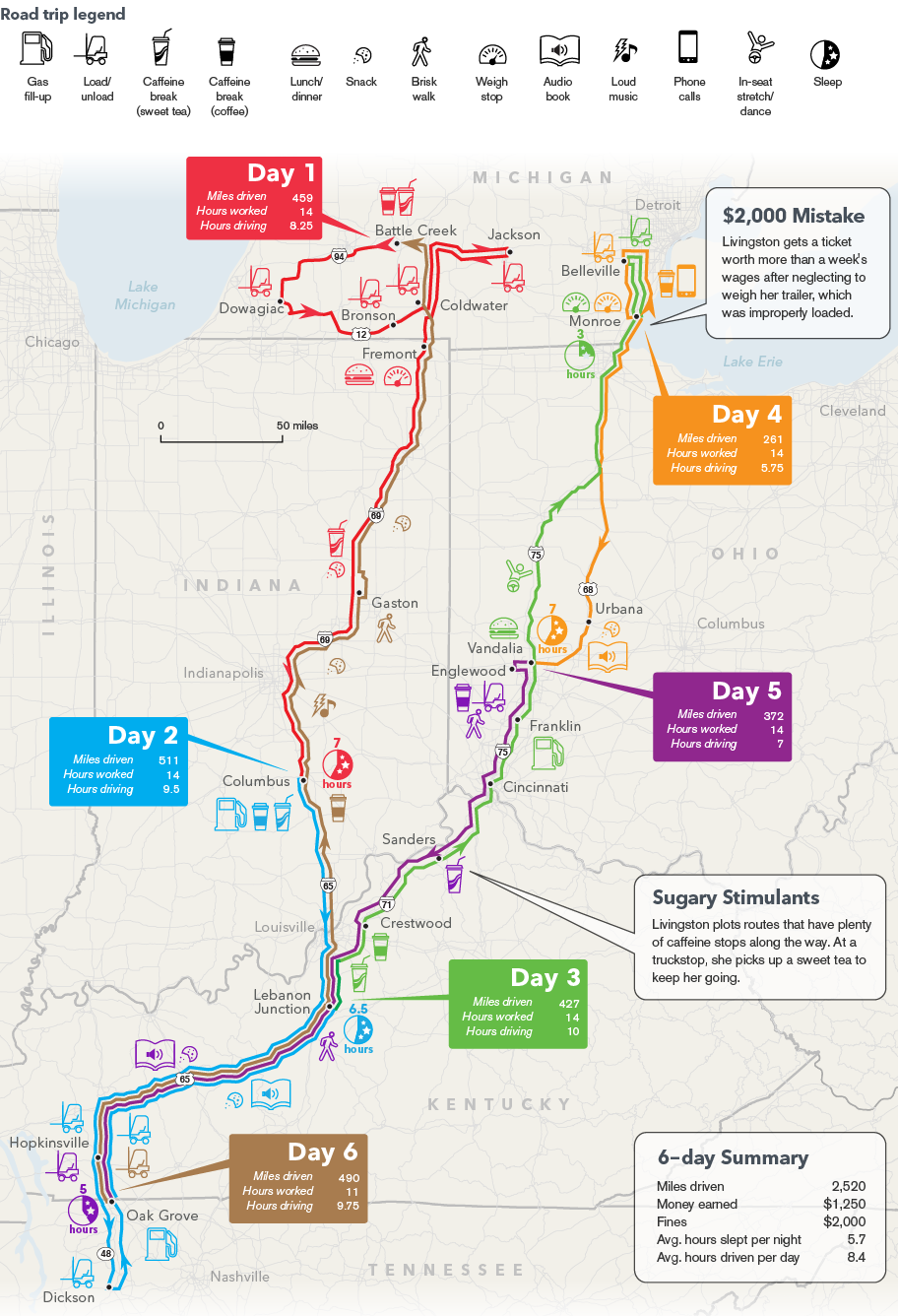