Wednesday, December 24, 2014

The Christmas Truce-1914

A hundred years ago today the fighting stopped - temporarily. The Christmas Truce was a series of ceasefires along the Western Front. World War I had degenerated into a stalemate and trenches were dug along the front lines. Opposing trenches were often very close and after a couple of months of living in close proximity under miserable conditions, a degree of empathy arose between enemy combatants. Soldiers sang Christmas Carols to each other across the trenches and eventually emerged to help each other with burials, exchange rations and play football.

This map from Silent Night: The Story of the World War I Christmas Truce* by Stanley Weintraub shows the location of the front lines at the end of 1914.
https://books.google.com/books?id=XGIf_fuYkmcC&printsec=frontcover&dq=silent+night+weintraub&hl=en&sa=X&ei=5x-YVImXFK2HsQTX5oKQBg&ved=0CCwQ6AEwAQ#v=onepage&q=silent%20night%20weintraub&f=false
Map image from Google Books
Many soldiers on both sides felt little reason to hate the enemy troops. Some of the Germans had worked in England before the war and many of them knew enough British culture to sing familiar songs to the "enemy" troops. Military and political leaders were deeply troubled by this lack of hostility and actively discouraged future truces, punishing those who attempted them.

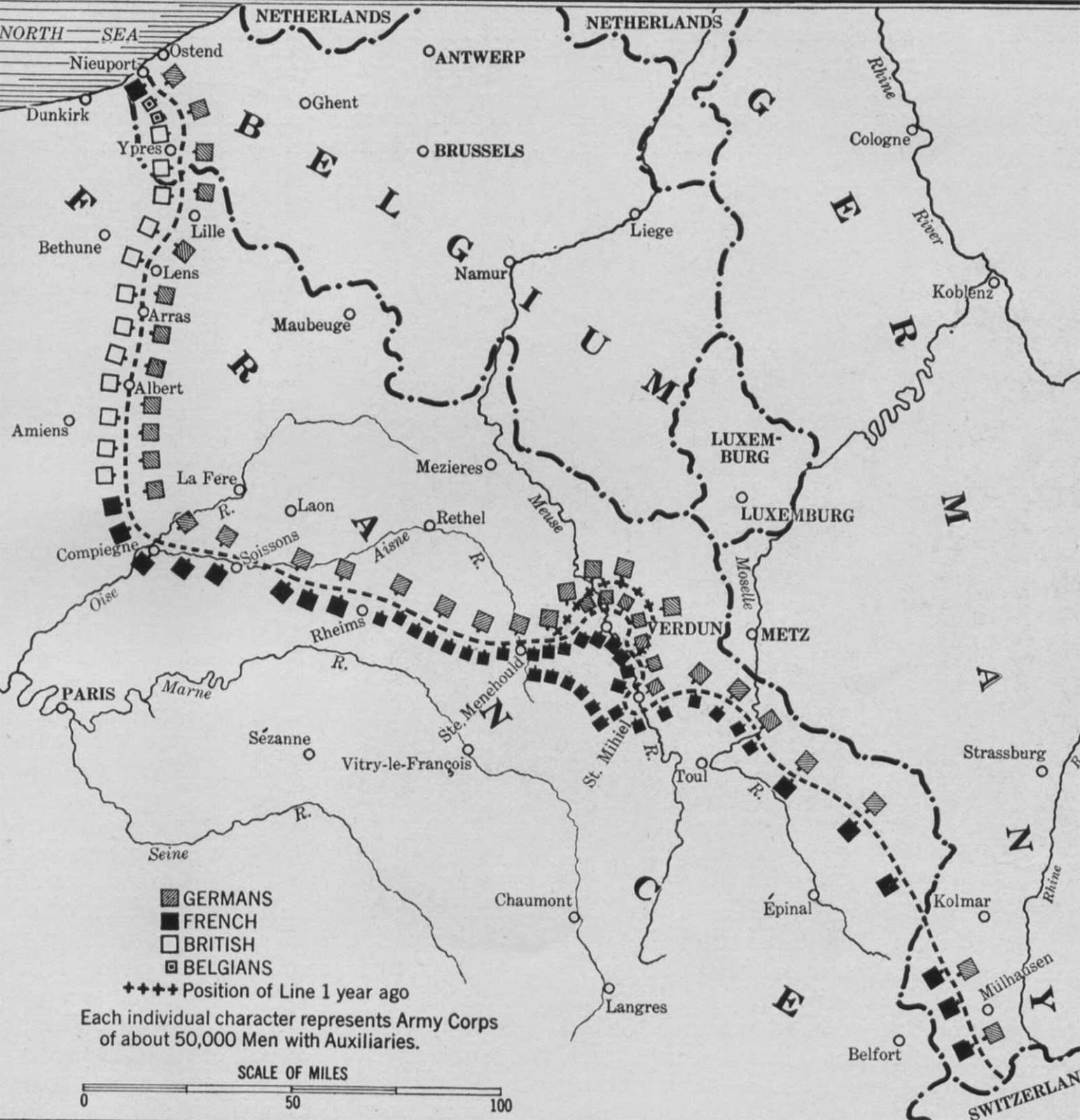
If the truce was in part a protest by the troops about the futility of their situation, the map below (from a military history site) justifies their sentiments. It shows the Western Front in the summer of 1916, almost completely unchanged after a year and a half of suffering and death. The front lines changed little until near the end of the war, almost four years after the Christmas Truce.
http://milpas.cc/rifles/ZFiles/WWI/Maps/nw_map_wf_1916_01.jpg
*Much of the information above is also from Weintraub's book-link here.

Wednesday, December 17, 2014

Shackleton's 1914 Antarctica Sketch

In 1914 Ernest Shackleton sketched out his plan to cross Antarctica on a menu card for the London Devonian Society's Annual Dinner.
http://www.theguardian.com/books/gallery/2014/nov/04/a-history-of-the-20th-century-in-100-maps-in-pictures#img-3
Shackleton served on two previous Antarctic expeditions but Roald Amundsen was the first to reach the South Pole, in 1911. After failing to be the first at the South Pole, Shackleton switched his focus to crossing the Continent, from the Weddell Sea to the Ross Sea. Here is the map in as much detail as I can find it online.
The Imperial Trans-Antarctic Expedition left Buenos Aires, Argentina on October 26, 1914 hoping to reach the continent by December and the South Pole by Christmas, 1914. The ship got stuck in ice in the Weddell Sea for almost a year and was finally crushed by the ice. The last contact was made from South Georgia on December 3rd, 1914. Here is a map from a 1916 Daily Telegraph article discussing the lack of news from the Expedition - via xefer.
http://www.xefer.com/image/shackletonx.jpg

The party endured a horrific multi-year rescue but they all eventually returned home alive. For more details see Wikipedia, or wait for the movie Endurance to be released next year.

Wednesday, December 10, 2014

The Wonderground Map

In 1914 London's Underground was frequently overcrowded, filthy and confusing. Frank Pick, the network's commercial director, wanted to lighten up the often tense atmosphere. He hired MacDonald Gill to design the "Wonderground" map, a whimsical cartoon map of the system full of jokes, puns and various other cute touches.
Copies of the map were hung in every station and it became an instant hit. There were reports of people missing trains, sometimes intentionally, because they were too busy looking at the details. The map makes London look like a cheerful medieval town, the feeling partially achieved by the coats of arms along the map's border and the fantasy architecture of the station entrances.
Here's an example of one of the puns, where the giraffe is "fed up."
In another joke, Russia is listed as one of the "villages."
Here, we have a poisonous reservoir and a horse that takes solace in carrots.


On the eve of World War I, the map took on many of the political and cultural events in a lighthearted fashion. For some soldiers leaving for the front, this may have been their last impression of London.

The map can be explored from this BBC News Magazine page. 

Wednesday, December 3, 2014

New York's Shadow Transit System

Aaron Reiss put together an interactive map and article for the New Yorker on New York's "shadow transit" system. It consists of dollar vans and unofficial shuttles that serve areas of the city poorly served by public transportation.
http://projects.newyorker.com/story/nyc-dollar-vans/
Dollar vans began running as a result of the transit strike of 1980. From the article:
Today, dollar vans and other unofficial shuttles make up a thriving shadow transportation system that operates where subways and buses don’t—mostly in peripheral, low-income neighborhoods that contain large immigrant communities and lack robust public transit. The informal transportation networks fill that void with frequent departures and dependable schedules, but they lack service maps, posted timetables, and official stations or stops. There is no Web site or kiosk to help you navigate them. Instead, riders come to know these networks through conversations with friends and neighbors, or from happening upon the vans in the street.
Reiss spent a year riding these vans and put together summaries of the major areas served along with videos taken from the vans. The videos and descriptions can be accessed by clicking each area on the online map. The routes continuously change according to demand. This makes it impossible to show all routes but the "major lines and connections" are shown here.

Tuesday, November 25, 2014

College Football Fan Map

The New York Times Upshot recently added College Football to its collection of fan maps.
http://www.nytimes.com/interactive/2014/10/03/upshot/ncaa-football-fan-map.html?action=click&contentCollection=The%20Upshot&module=RelatedCoverage&region=Marginalia&pgtype=article&abt=0002&abg=1&_r=0
I like how faithful the boundaries are to the state borders. Even in Kansas where they have a reciprocal arrangement with Missouri for in state tuition and plenty of students from Missouri, the boundary is pretty precise.

Using the university colors is a nice touch but it also has the effect of overemphasizing the red schools. What really jumps out here is Nebraska, Wisconsin and Ohio State, whereas Oregon's impressive reach into California, Montana and Alaska fades info the background. The other problem with the college colors is when you have similar adjacent colors. It's especially hard to distinguish Alabama and Georgia here. South Carolina and Auburn are also in the same color family.

I also like the small pockets of fandom for the lesser state schools such as Michigan State, Kansas State, Iowa State and that little university in Virginia whose relative lack of football success has made Virginia Tech the overwhelming choice of most of that state.   

The Upshot did a related map showing where college football is the most popular.
http://www.nytimes.com/2014/11/08/upshot/the-places-in-america-where-college-football-means-the-most.html

While I'm not convinced that the Facebook "like" is the most reliable measure of our culture, it does make for an easy data set and results in a clear pattern. If this map was done in a grey scale, reversed out and overlaid on top of the first map, you'd get a picture of not only who people like but how strongly. I'd do it if I had time but work beckons.


Wednesday, November 19, 2014

Misleading Buffalo Snow Maps

As we prepare to spend Thanksgiving with my wife's family in western New York, here are some maps of what we could be in for. This one, posted on Flowing Data a few years ago does a nice job of showing the lake effect snowbelt south of Buffalo. But there are problems...
http://flowingdata.com/2007/09/27/misleading-map-of-buffalo-snow/
Green implies that the rest of the area including Buffalo (inside the dashed box) is not so bad. However, a look at the legend shows that green is up to 80 inches a year and the yellow that appears in many of the suburbs is 90-100 inches. Chautauqua County people may consider 80 inches to be minor but for the rest of us this color choice is terribly misleading.

The map also may need an update as parts of the region are getting half their average this week.
http://lintvwwlp.files.wordpress.com/2014/11/wivb-snowfall-map.jpg
 Be "4 Warned" - this is another misleading map. How much snow will we see in Rochester? Apparently nothing even though family members tell us otherwise. The dropoff from 18-24" to nothing at the Livingston-Wyoming county line is remarkable as is the sudden lack of snow in Erie County, Pennsylvania. No data and no snow are not the same thing so don't treat them the same.

Thursday, November 13, 2014

Inversia

Sometimes a poorly colored map makes it difficult to distinguish land and water. What if they were reversed?  "Swap dirt and water" and you get Inversia.

http://www.worlddreambank.org/I/INV.HTM

Of course, it's not that simple. Creator Chris Wayan lays down a series of ground rules. For example, the most shallow ocean areas would become depressions that would fill up with rain water. This results in a series of lakes and seas in the middle of the oceans. These are important to the ecosystem of Inversia because the oceans have become large deserts due to coastal mountains blocking rainfall. The lakes provide much needed water sources for life here.

There are still Andes Mountains and a trench along the west coast of South America but reversed. The Great Lakes have become the Great Isles. Hawaii and the Azores are Seas and the Mariana Trench is now the world's highest mountain range. The web page is full of well thought out descriptions of the life, climate and ecology of Inversia. Enjoying exploring!


Wednesday, November 5, 2014

Election Maps Elsewhere

Those of us in the USA will be seeing many election maps over the next few days. In the interest of not being every other site, here are some maps of other important elections that have happened this year in large countries that we (myself included) pay much less attention to than we should.

Brazil
http://i.imgur.com/pcXhscv.png

In last month's election, incumbent president Dilma Rousseff won both rounds. The map above shows her vote in the runoff election in red and challenger Aecio Neves in blue. On the right is a cartogram - areas proportional to population. Usually cartograms do a better job of showing results but in this case it's actually more difficult to see that she won than the conventional map. I suspect it's due to the strength of support Rousseff saw in the areas she won.

This map uses a gray neutral color instead of the purple we often see in our red-blue maps. This makes for a clearer distinction of areas. Author Diogro Melo does a nice job listing his sources, even for the colors.  He also has a link to the code used to create the cartogram.

India
http://upload.wikimedia.org/wikipedia/commons/e/e6/Indische_Parlamentswahl_2014_Parteien.svg

India had a major parliamentary election in the spring and the BJP with it's allies (the National Democratic Alliance) won a major victory over the Congress party and their allies. A huge number of parties in India would normally make for a colorful map, but in this case it is mostly BJP orange. Congress allies are shown in shades of blue. A cartogram would have shown much more blue with many of the small blue areas being large cities - more colorful, yet uglier as cartograms tend to be.

Indonesia

The world's fourth most populous country had its third presidential election. Twelve parties formed two coalitions with Joko Widodo's coalition winning.
http://en.wikipedia.org/wiki/Indonesian_presidential_election,_2014#mediaviewer/File:2014IndonesianPresidentialElectionMap.png
 The red/crimson (what?) color scheme used on Wikipedia is unconventional and barley works. Widodo's winning coalition is red, Subianto and Harvard University are crimson. The geographic pattern is basically Sumatra vs. elsewhere. This map would probably be more interesting with more parties, instead of just the two coalitions. Like, for example, the 2009 Election
http://en.wikipedia.org/wiki/Indonesian_legislative_election,_2009#mediaviewer/File:2009_ElectionsIndonesia.png

Afghanistan

Less populous but also important is Afghanistan. Their election suffered from violence, accusations of fraud and a lack of good maps. Here is the best map I could find.  
http://russiaeasternrepublic.files.wordpress.com/2014/06/afghanistan-electoral-map.jpg

Votes for Ashraf Ghani, the declared winner are shown as green proportional circles. Votes for Abdullah Abdullah (the candidate so nice they named him twice) are in purple. The trouble is in making out a pattern underneath the noise of the heavy colors representing ethnicity. A simple dulling of the ethnic colors and/or brightening the circles would help see the relationship between these patterns. Even better would have been to choose colors for the circles that are clearly different from the ethnic colors.

Egypt also had a presidential election. I have not been able to find maps, probably because el-Sisi won 97% of the vote*. I suppose the map would look like this. 

* 97%? A bit above the credibility threshold?


Wednesday, October 29, 2014

Airline Timetable Maps

Airline Timetable Images is a remarkably comprehensive collection, compiled from the collections of Björn Larsson and David Zekria. I have wasted many hours looking through their collection at vintage airline maps for example, Air Zaire, 1978.
http://timetableimages.com/ttimages/zaire3.htm
 The maps range in style from this highly schematic, barely legible 1970 Air Canada map,
http://timetableimages.com/ttimages/ac/ac70.pdf
to this geographically detailed schedule from Regie Air Afrique with artistic flourishes,
to this artistic take from Aeroposta Argentina from 1937 featuring a curved, oblique view showing airports(?)  with their hangars and radio towers, or are those trees? 
Click the image for a larger view.
http://timetableimages.com/ttimages/complete/aeropa/aeropa-1.jpg
Air Canada's maps were not always this schematic. Here's what it looked like in 1945.
http://timetableimages.com/ttimages/complete/tc45/tc45-1.jpg
My first airplane trip was in 1972 on Eastern Air Lines, from Philadelphia to Houston with a change in Atlanta. Looking at their map from that year confirms that Atlanta was clearly their hub.
http://timetableimages.com/i-df/ea7209i.jpg
My memories from that flight were the breakfast sausage (we didn't get that at home) and thinking "we must be over Alabama now so those must be the covered wagons" - I had a little confusion as a child about where and when covered wagons existed.

Here is one of the oldest maps from Eastern - 1933.
http://timetableimages.com/ttimages/ea3307a.htm
I wanted to show a current map for contrast but there are not many on the site to choose from. Here is a 2010 map from Emirates with the familiar spiraling lines coming out from the hub (Dubai). This map features an overabundance of detailed topography. The mercator-like projection may be helpful for showing the large number of northern European destinations but also uses way too much map space on Siberia and northern Canada. The map also shows how much more important Toledo (Ohio, not Spain) is than you ever thought possible.
http://timetableimages.com/i-df/ek1003i.jpg
Try this at home! You might find a timetable or map for some of your flights.

Wednesday, October 22, 2014

Crowdsourced Mapping Helps Fight Ebola

Ten years ago this month Google acquired a mapping company called Where 2 Technologies and began to create Google Maps. Despite the tremendous growth of Google Maps over the last 10 years, there are still areas that are poorly mapped. When Doctors Without Borders wanted maps of the areas in Guinea, Sierra Leone and Liberia that are most affected by Ebola, they turned to OpenStreetMap, a worldwide, crowdsourced mapping project. A recent article from Fast Company Labs details how the Humanitarian OpenStreetMap Team (HOT) has gotten volunteers to quickly map cities like Gueckedou in Guinea. This image compares the level of detail between the two mapping services.
http://www.fastcolabs.com/3037350/elasticity/inside-the-crowdsourced-map-project-that-is-helping-contain-the-ebola-epidemic
OpenStreetMap is on the left, Google Maps on the right. The limitations of this blog page make this hard to see so I manipulated the images to compare them up and down.
Andrew Buck, A volunteer with HOT is quoted in the fastcolabs article as saying that Google's business model is selling advertising and “Starbucks isn't paying for Google to advertise over there so there's very little incentive for Google to improve its maps.”  

In fairness to Google, the OpenStreetMap for Gueckedou much less detailed than Google before the HOT team got mapping.
Since March the team has mapped over 8 million objects. The article has a nice animation showing the edits made in West Africa in the last six months. I was not able to it reproduce here but you can see it on their page.

OpenStreetMap has helped relief efforts by identifying unknown villages, sorting out similar village names, coordinating logistics and allowing relief workers to predict the paths used by infected persons and therefore areas that are more likely to be in need of aid.

Wednesday, October 15, 2014

Flying Map Cancels Soccer Game

A drone carrying a flag that features a map of "Greater Albania" flew over the pitch in Belgrade during the Serbia vs. Albania Euro 2016 qualifying match. One of the Serbian players pulled the flag down, resulting in brawls among the players and fans and the game was subsequently canceled.
http://www.dw.de/albanian-pms-brother-arrested-as-euro-qualifier-with-serbia-abandoned/a-17996531
My quick assumption was that this was a map showing Albania united with Kosovo, an independent republic still claimed by Serbia. However, the shape is completely different. After some digging I came across a map of Greater Albania that explains the shape.
http://www.novinite.com/articles/122305/%27Greater+Albania%27+Enjoys+Massive+Support+in+Kosovo,+Albania,+Macedonia
Not only do the Greater Albania supporters want Kosovo but also large chunks of Serbia, Macedonia, Montenegro and Greece. Good luck with that!

More details on the soccer (football) story here.

Wednesday, October 8, 2014

Melbourne After Dark

The International Cartographic Association (ICA)'s Commission on Map Design has been posting a map every day this year to highlight examples of great map design. Here is just one of the many maps worth highlighting - there may be more to come as time allows. This is a 1979 map by Cartographics International showing what establishments were open at night in Melbourne, Australia. These color choices were designed to be read at night under the street lights, while also creating a night-time look.
http://mapdesign.icaci.org/2014/06/mapcarte-176365-melbourne-after-dark-by-cartographics-international-1979/
The detail provided on the ICA page shows a happening neighborhood full of places to eat, "massage parlour/health studios" (pink lanterns) and coffee shops. The full map has a couple of areas blown up and pulled to the side, the lower left one appears to be a red light district. The bottom of the map shows some nightlife images that add to the exciting and vaguely sinister feel of the map.
http://mapdesign.icaci.org/2014/06/mapcarte-176365-melbourne-after-dark-by-cartographics-international-1979/
For a good writeup and the original images take a look at the ICA's page from June 25th.

Wednesday, October 1, 2014

Draining California

National Geographic has an article about the California drought in the October issue called When the Snows Fail. The magazine comes with a fantastic pull-out map showing the natural and manipulated ways that water flows out of the Sierra Nevada into the Central Valley, the heartland of US agriculture.
#
The printed map sprawls across several flaps and shows a broad view of the entire regional water system in a way that can't possibly (or legally) be shown here. The image above gives an idea of much of what is shown on the map including aqueducts  (light blue lines), agricultural areas in green, dams, reservoirs (with information about  percentage above or below capacity) and various other bits of textual information.

Their web site has an interactive graphic that captures some of the map's information. Click on the second tab for the graphic, the first one is the article. The graphics do a nice job of showing the flow of water from the headwaters of the Rubicon River, near Lake Tahoe, into reservoirs, lakes, the American and then Sacramento Rivers. Three years of drought have left dry shorelines, lower volumes of surface water and increased use of wells causing subsidence of the land. 
http://www.nationalgeographic.com/west-snow-fail/
The interactive web graphics are very well done, but also are a good illustration of how computer images still cannot provide the awe inspired by a large paper map. I highly recommend getting a hold of the magazine and taking a look at the full "centerfold."

Wednesday, September 24, 2014

The Perils of Ancient and Modern Travel

An ongoing series of articles in National Geographic detail Paul Salopek's walk to trace the spread of humans throughout the world. In the most recent installment, he walks across the Hejaz of western Saudi Arabia, visiting ancient wells - the blue symbols on the map.
http://ngm.nationalgeographic.com/2014/07/hejaz-desert/route-map
These wells were located a days walk away so that travelers would be able to traverse the desert region. Knowing the location of the wells was a matter of life and death.

And now for something completely different - a ridiculous comparison!

Today's electric car pioneers face a similar difficulty. Routes must be carefully planned around the location of charging stations. A recent article in the Mercury News details the first cross country trip in a Tesla by John Glenney. The article includes this map of their charging stations.
http://www.mercurynews.com/portlet/article/html/imageDisplay.jsp?contentItemRelationshipId=5692710
Tesla has a network of charging stations located close enough (about 265 miles per charge) to be able to travel certain routes across the USA. During Glenney's trip the Hagerstown, Maryland facility was not ready. He had a stressful trip from Newark, Delaware to Somerset in western Pennsylvania, arriving with only 11 miles left on his charge.

As the Tesla network expands, trip planning will gradually become less important as it has in Saudi Arabia, where drivers can find bottled water at gas stations. The wells now sit abandoned as traffic rushes past and planes fly overhead.

Wednesday, September 17, 2014

Scotland's Independence Vote In Maps

Tomorrow Scotland votes on independence. I don't have a "dog in this fight" though there is a "Duggy Dog" starring in a pro-independence video.
This map does a nice job of illustrating the political situation in service of the Yes campaign.
http://wingsland.podgamer.com/wp-content/uploads/2012/04/advertdraft2b.jpg
The Yes campaign also has a video titled Scottish Weather Forecaster Loses It Live On Air with some good map content. Here are a couple of still frames.
On the "No" side there's this map from The Economist full of typically snooty Economist cliches.
http://i.telegraph.co.uk/multimedia/archive/02192/the-economist_2192486a.jpg
We get it. They're a buncha moochers!

Finally, there's the cover of The Battle for Britain by David Torrance...
https://www.bitebackpublishing.com/books/the-battle-for-britain-paperback
... and its copycat images.
http://www.zazzle.com/scottish_independence_cut_here_map_postcard-239672291035838057
http://www.presstv.ir/detail/2013/05/01/301204/scots-indep-end-of-uk-as-power-mps/