Tuesday, December 31, 2013

I Saw a Peutinger Map Replica at ISAW

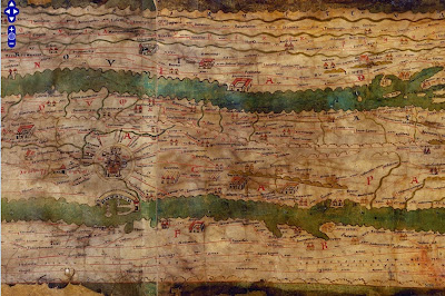
This weekend I was in New York City and had a chance to wander over to the Institute for the Study of the Ancient World (ISAW) to see their exhibit, Measuring and Mapping Space: Geographic Knowledge in Greco-Roman Antiquity.  The exhibit features a 1:1 scale digital replica of the Peutinger Map, the only known surviving world map from the Roman Empire. This is a medieval era copy of a map from Roman times housed at the Austrian National Library in Vienna. The map is over 22 feet long and only about 13 inches wide. The digital replica takes up one wall of the gallery. Here are some photos from my phone. 
The map is centered on Rome. Above are the roads radiating out of Rome, including the Appian Way. It is meant to show a schematic road network and the extent of the empire's control from the British Isles to India and Sri Lanka. The geography is highly distorted to fit the dimensions with the areas closer to Rome much larger and more accurate. Expanses of open water are reduced to narrow channels. Small cities are represented by twin towers while larger ones show temples and other complexes. The largest cities, Rome Constantinople and Antioch are shown with more elaborate symbols. Below is a section in Mesopotamia.
You can see these areas much more clearly on the ISAW map viewer. This allows you to pan and zoom around the entire map, except for the far western edge - missing from the original map. You can also add lines and text digitized from the original for clarity.
http://peutinger.atlantides.org/map-a/
Wikipedia also has a cleaned up high resolution image of the map. The missing western areas were reconstructed by Konrad Miller in 1887-88 and show up with a white background. The original parts of the map are shaded in yellow. The preview image below gives you an idea of the map's crazy dimensions.
http://en.wikipedia.org/wiki/File:TabulaPeutingeriana.jpg

The exhibit at ISAW only goes until January 5th, but hopefully the online resources will remain available.

Tuesday, December 24, 2013

The Way I Tauk

The New York Times has an interactive quiz where you can see where you are likely to be from based on your speech. Here are my results:
I was born in New Jersey and spent my formative years in Philadelphia and upstate New York* so this is pretty good. The maps at the bottom show your "most distinctive" answers. Sneakers does not seem very distinctive to me and hoagie is kind of a trick question. To me a hoagie is a certain type of sandwich, whereas others are just subs. I would never eat a tuna hoagie though some people might call it that.

Also interesting is the results of where your speech is the least similar. I am clearly NOT from Spokane. There is certainly a pattern here.
Don't be caught saying "mountain lion" in Tacoma! Unless referring to an Apple operating system.
 
The quiz is based on the Harvard Dialect Survey, a linguistics project begun in 2002 by Bert Vaux and Scott Golder. The original questions and results for that survey can be found on Dr. Vaux's current website.
From the New York Times Site:
The data for the quiz and maps shown here come from over 350,000 survey responses collected from August to October 2013 by Josh Katz, a graphics editor for the New York Times who developed this quiz. The colors on the large heat map correspond to the probability that a randomly selected person in that location would respond to a randomly selected survey question the same way that you did. The three smaller maps show which answer most contributed to those cities being named the most (or least) similar to you.
If you're wondering where you are from, take the quiz here

*Yonkers in NOT upstate New York despite what Longislanders might think.

Wednesday, December 18, 2013

Map Ties and Other Gifts

Personally I hate ties and wear them as infrequently as possible. However, these map ties are pretty cool. Who wouldn't want a tie with a vintage 1868 pictorial map of Iowa City?

http://www.zazzle.com/vintage_pictorial_map_of_iowa_city_1868_tie-151593703370207631
You can customize them too - meaning you can pan and zoom to show your favorite part of town. I don't actually have a favorite part of Iowa City - I just picked one.
There are lots of vintage and other unusual maps listed. I like the weather map one.
http://www.zazzle.com/weather_map_custom_ties-151182078250058710

Of course these ties would look great with a pair of cuff links.
http://www.uncommongoods.com/product/custom-map-cufflinks

South Portland, Maine if you were wondering.

Wednesday, December 11, 2013

The Islamic World

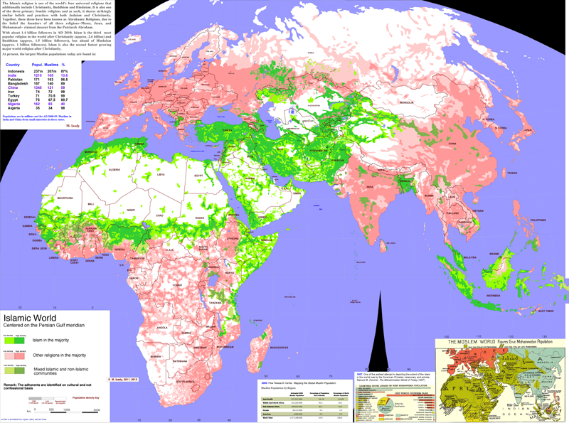
Columbia University's Gulf/2000 Project was created as a service to scholars, journalists, politicians and other professionals working in the Persian Gulf region. The web site for this project contains some fantastic maps created by Dr. Mehrdad Izady showing population, religion, language and other divisions that affect the region.

His large map of the Islamic World is particularly striking. Many of the recent conflicts in the world have occurred along the boundaries of Islam and other religions such as in Mail, Nigeria, Central African Republic, Sudan/South Sudan, the Caucasus region and in parts of India and Pakistan.
http://gulf2000.columbia.edu/images/maps/Islamic_World_Basic_lg.png
The lower right corner of the map contains a 1907 map depicting the extent of the "Moslem World." The overall pattern is largely the same as today.

"Syria Ethnic Composition" is another very detailed map showing how diverse that country is. The text on the right describes how much of this complexity is lost when language is considered the defining ethnic characteristic. The commonly used "Arab" ethnic stamp glosses over these divisions but the current conflict in Syria has shown their significance. 
http://gulf2000.columbia.edu/images/maps/Syria_Ethnic_Detailed_lg.png

The maps page has many other highly detailed maps not just of the Gulf region, but the entire Middle East as well as parts of Africa and Asia. You can spend hours looking at these. I did. 

Wednesday, December 4, 2013

Pictorial Savannah

Friend of the blog Michael Karpovage has won the Best Recreational/ Travel Map in the 40th Annual Cartography and Geographic Information Society (CaGIS) Map Competition (2012). I was waiting for some exciting announcement from CaGIS but the gallery of winners is merely a list - no pictures or even links to see what these maps look like. Here are some pictures lifted  from his website.
http://www.karpovagecreative.com/maps#!savannahmap/c27x
The image above shows Side A highlighting the historic district. Here is a closer detail showing the area where we stayed recently.
Below is Side B showing a broader view and listing the attractions.
http://www.karpovagecreative.com/maps#!savannahmap/c27x
Finally, a detail showing Mr. Karpovage hiding in the shadow of an oak tree.
 Congratulations Mike!

Wednesday, November 27, 2013

Wooden Bathymetry

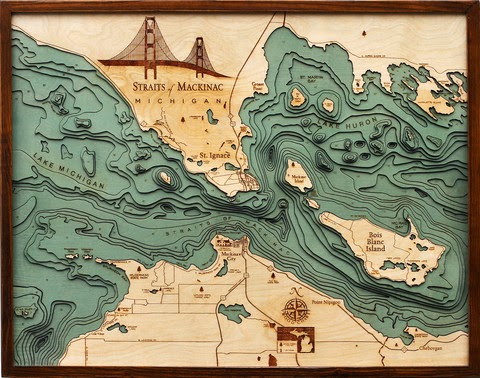
Below the Boat sells wooden charts made by laser cutting contour lines from bathymetric charts. They feature maps of various coastal areas and lakes such as Lake Tahoe,
http://www.belowtheboat.com/products/lake-tahoe
http://www.belowtheboat.com/products/san-juan-islands 
http://www.belowtheboat.com/products/straits-of-mackinac
http://www.belowtheboat.com/products/virgin-islands
and many more. Explore their gallery and you'll see lots of pictures of cute pets posing with their maps.

Wednesday, November 20, 2013

Kennedy Assassination Infographic

Friday will be the 50th anniversary of the Kennedy Assassination. I am not well versed in the conspiracy theories. Reuters produced a good infographic/map showing the layout of Dealey Plaza that helps clarify the events.
I don't know when or where this image was originally published but there is a nice interactive version of it on speakingimage where you can zoom, pan and click a few points for details.

Friday, November 15, 2013

The Cloud Corridor-Srsly?

Neighborhood rebranding is popular with real estate people. Newer, cuter names will sell more property. Now the technology sector in San Francisco is coming together to try and rebrand several distinct neighborhoods into a Cloud Corridor.
If your business is in this area they want you to start using the Cloud Corridor term in marketing materials, press releases, twitter hashtags and in general conversation. Their San Fran. style self congratulatory rhetoric tells of how they have replaced the Silicon Valley as the new "hub of innovation" and with this rebranding "can capture the hearts and imaginations of the local talent and the wider world."

Of course this area covers much of downtown San Francisco so I suspect the huge number of non-cloud business owners, employees and residents in this "corridor" may not be too happy about being rebranded. Also, the cloud-shaped boundaries on this map look kind of silly. The metaphor doesn't work if you consider that the areas "in the cloud" are the negative space (the rest of the city.) Finally why did they extend the corridor off the map to the west where there are no googledots? Are they suggesting unlimited future growth?


Wednesday, November 13, 2013

Nature's Toll on the Philippines

National Geographic has an excellent map showing all the problems nature causes for the Philippines. Not only are the islands magnets for huge typhoons, they also have to cope with earthquakes, volcanoes and landslides. The light brown lines represent a mere 10 years of storm tracks.
http://news.nationalgeographic.com/news/2013/11/131111-philippines-dangers-haiyan-yolanda-death-toll-rises/
The islands are located in a very warm part of the Pacific with no major land masses to the east so they get the full force of these storms. More than 60 percent of the population lives in coastal zones, often in poorly constructed housing. High rates of poverty mean that many people have little control over their living situations. Deforestation has caused mudslides which in turn create sediment clogged stagnant water leading to outbreaks of cholera. On top of all of this, the Philippines are located in the Pacific "ring of fire" where volcanoes, earthquakes and tsunamis are common.

For a more complete summary of their precarious situation see the National Geographic article.

Thursday, November 7, 2013

The Great Lakes Storm of 1913

100 years ago today was the beginning of the Great Lakes Storm, the most deadly and destructive storm to ever hit the region. Also known as the "White Hurricane" because of the blinding snow that fell, the storm killed over 250 people, destroyed 19 ships and stranded 19 ships and some additional cargo barges. The storm raged for several days with a few lulls that only served to give false hope to stranded mariners. Most of the destruction occurred in Lake Huron. Wikipedia has this excellent map, originally from the USGS showing sunken ships in black and stranded ones in gray. Click for the original, more readable image.
The storm intensified and built up to hurricane force on November 9th. The US Weather Bureau only issued reports twice a day so most of this build up was not noted until too late. Cleveland saw 22 inches of snow and lost power for days as did much of the region. Breakwaters were destroyed in Chicago and Milwaukee.
   
There is a story on NPR's Morning Edition on the search for two ships in Lake Huron that have never been found. Another interesting account of the attempts by some crews to survive can be found in The Paragraph.

Wednesday, October 30, 2013

What's Your State?

A recent study of America's mood by state, published in the Journal of Personality and Social Psychology, is featured in Time Magazine. There is a test you can take to see what state matches your personality. With all the discussion about introverted, neurotic people from the northeast, I figured I fit in perfectly but much to my surprise that wasn't the case.

Oregon????? I must have answered some of the questions more wishfully than truthfully. The regional patterns here are pretty clear and the article has interesting explanations for some of them. The west coast is clearly a separate region but I don't usually think of Arizona or New Mexico as part of that region and certainly not North Carolina. Texas is another odd one but they've seen lots of in-migration and immigration so maybe that state is more complex than the cliches suggest. Plus, according to another Time article and magazine cover, they are our future. Nice cover art!

http://content.time.com/time/magazine/article/0,9171,2154995,00.html?pcd=pw-magic

By the way, if you take the test and enter the default value (neither agree nor disagree) for each question, you end up with Texas. Have fun taking the test. You too may end up in an unlikely place.


Friday, October 25, 2013

Literary St. Louis, The Arch Enemy

The World Series heads to Saint Louis this weekend. Not only do they have baseball and toasted ravioli but according to artist Dan Zettwoch they also have "book 'n writers 'n stuff."

His blog post details the evolution of this drawing, done for an article in the Riverfront Times. The original idea was for a pop up book.
This proved to be too difficult so he went back to 2D space and used some "vectors" (GIS data?),
added some figure drawings...
.. and finally some color to get the finished product. Click the first picture or the detail below for a larger image and explanation of the numbers.


Wednesday, October 23, 2013

What Each Country Leads the World In

The web comic Dog House Diaries recently posted this map - click for the large version.
Though the map looks goofy, it is based on mostly credible sources which are listed here.

Some of the most interesting stats involve small countries so you really need to do some zooming and panning to see these. Here are some examples.

Most bad driving - this is judged by road deaths per 100,000 cars and the award goes to Togo - incorrectly placed in Benin. Yes I had to check that too to be sure they got it wrong.

Happiness - Costa Rica

Brazil Nuts - Bolivia, not that other place

Highest High School graduation rates - Portugal

Home ownership - Bulgaria

Highest valued currency - Kuwait

Use of social media - Philippines

Highest quality of life - Ireland

And finally the award for longest alphabet goes to Cambodia

You might want to get a hot drink and a Mohnflesserl and do some exploring.

Saturday, October 19, 2013

Great American Menu?

This map, posted on Deadspin is getting lots of attention. It is accompanied by an article that is snarky, nasty, ignorant and pretty damn amusing. Many humor-challenged* people are commenting with the inevitable regional fights over who has better pizza and whether anyone outside of the Philadelphia area is qualified to rate cheesesteaks (they're not.)


The crappy color scheme represents the ranking categories. Blue is great, yellow good, red is "better than a finger in the eye" and black is "being hit by a car," a distinction reserved for Ohio. Nevada also gets a unique color for having nothing distinctively authentic. Whether it is fair to judge a whole state by one bad Cincinnati chili experience or not is open to (lots of) discussion as is everything else on this map. Enjoy the map and article and be sure to leave your angry comments like everyone else has.

*Many of the comments are actually pretty funny - some even intentionally so.

Wednesday, October 16, 2013

Maps Recycled Into Art

Artist Matthew Cusick creates art from pieces of maps for a series called Map Works. There is much goodness to see online including waves,
 highways,

 blue horses,
landscapes,
and people, many in various states of undress.
Thanks to friend of the blog Rafael who sent me a link to this artist over a year ago. Sometimes it takes that long for me to find the right time to post something.

Wednesday, October 9, 2013

Musician Inspired by Population Map

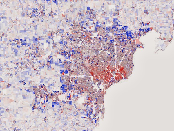
Vienna Teng's new album Aims features this map on the cover. It shows population migration within the Detroit metropolitan area.

The map is from Stephen Von Worley's Data Pointed blog. I'm not sure why the colors look so washed out in Teng's cover. The original is much more "pretty"
The inspiration comes from digging beyond the typical narrative of population flight from the inner cities (red is population loss) to see that there hope in the small patch of blue located near downtown. This is not really a new story, people have been moving into downtown areas for several decades now. Still, it's a good reminder that our cities still have much to offer as places to live. There are lots of other striking images of various US metropolitan areas to see on Von Worley's blog post, most of them showing a similar pattern.

Thursday, October 3, 2013

Unrelated to anything

Someone pointed me to some great map links on the Census Bureau's website but since that part of the government doesn't exist right now you can't see them. Instead I'll bring you the latest Onion Sports Network poll map. The geographic distribution is as meaningless as some of the categories.


If you like this map there's plenty more here.

Wednesday, September 25, 2013

The Strangest Driving Laws on Earth

From the Visual Data tumblr site - click for readability:
Apparently this is from an insurance company though I don't see the map on their page. Some of these laws aren't really that strange, other ones I'm a little skeptical of. Does Tennessee really ban shooting whales from a moving vehicle? Another cherished freedom out the window.

Wednesday, September 18, 2013

Waterplace Park, Providence

I am at the GIS-Pro conference in Providence, Rhode Island and don't have time for a real blog post so here is a "you are here" map. 


Wednesday, September 11, 2013

The MBTA Map Competition Finals

In the Spring Boston's MBTA launched a competition to redesign the system map. The six finalists have been announced and you can vote for one of them until September 20th. I'm partial to "Map 4" by Kenneth Mirsaki though it has several cartographic problems.
It's not the most clear or easy to read map and those weird grey shadows which I guess are supposed to represent surface routes leave a false impression of elevated tracks. Still, I like the overall design concept and am not one of those people who think transit maps must conform to 45 degree angles.

"Map 1" should probably win. Less interesting but much better clarity. Also pleasing to the 45 degree partisans.
The other ones leave me with a "meh" reaction. I don't really like skinny lines and overly schematic looks.
For reference here is the current "Spider Map" used by the MBTA.

More interesting than any of this are some of the entries that didn't make the final cut. For example this sweet little needlepoint map (left) or the tree map. Neither of these will get you very far if you don't already know your way around.


There's also one I refer to as the "Chicago" map (below left) because that's what the geography looks like to me and a hideous but useful map showing distances from Downtown Crossing.


Cast your vote soon! Thanks to blog reader Christine for pointing out some of these.