Wednesday, June 30, 2010

Map of the Week-GOOD Volcano Map

GOOD is an online journal that asks the question "what is good right now?" One of the highlights is their "transparency" series of graphics and maps. The latest transparency shows how small the recent Eyjafjallajökull volcanic eruption in Iceland was compared to other historic volcanoes. The disruption to the economy and to air traffic was huge but as the graphic indicates we should expect much worse in the future.


The tall orange triangles on the map are "decade volcanoes." I've never heard that term either but according to the description page it means a volcano "currently noted to have a history of large eruptions and a proximity to populated areas."  In other words if one of those blows it's really going to mess things up.

Thursday, June 24, 2010

Map of the Week-The $5.5 Million Fence

The G20 summit is coming to Toronto this weekend and you are NOT invited! They are building a security fence in your honor at an estimated cost of $5.5 Million according to the Globe and Mail. The fence is outlined in red on the map below. The lighter shaded area is where automobile traffic will be tightly controlled.


This area is right in the middle of downtown and encompasses many theaters, hotels, restaurants, sports venues and other attractions such as the CN Tower. Most of these places will be closed and the Toronto Blue Jays will be playing their "home" games this weekend in Philadelphia. That means the area's 25 or so baseball fans will miss Roy Halladay's big return to Toronto.

The Globe and Mail has an interactive map showing the security and closures. The items on the left side of the map can be clicked for locations and more information.


 Also, if you are in or near the area be prepared to look good because you will be photographed as illustrated by this security camera map from the Toronto Star.

Map of the Week Bonus Coverage

A week ago the Los Angeles Lakers won another NBA title - zzzzzzzzzzzzzzzzzzzz. To honor the occasion here's a map cartoon from the New Yorker by Michael Crawford titled "Los Angeles Getting More Annoying as We Speak."


Wednesday, June 16, 2010

Map of the Week-The Atlas of True Names

I missed the Atlas of True Names when it first came out almost two years ago but they now have an iPhone app so that gives me an excuse to talk about it. The Atlas takes the etymology of place names and translates their original meaning into modern English. London becomes "Unfordable River Town", San Francisco is "Saint Little Frank One", etc. Here is an iPhone screen shot of southern Africa.


 When you click on a country, it gives you some etymology.


Unfortunately, the Land of the People with Tall Caps did not make the iPhone map. This is from the world map detail on their web page. The area looks identical on the phone except for no people with tall caps. I want my money back!


 There are some additional search and bookmark functions but that's mainly what you get for your $3.99. The World Map is nice but you don't get the level of detail that you get from some of the regional maps like their online example below. Hopefully that will be a future enhancement.


Wednesday, June 9, 2010

Map of the Week-World Cup 2010

The 2010 World Cup in South Africa begins in 32 hours. Of course you will need some good maps to get you to the stadiums. Here is what I have been able to dig up. First, the official map from FIFA, it's kind of dull but you can click each city and get some basic information and a touristy picture for each place.


The 2010 World Cup in South Africa site has a prettier map with stadium pictures but what do those colors mean? Topography? Not exactly. Do the colors add anything useful to the map? Not exactly.


At the more local level Map Studio has some excellent area maps showing the stadiums and nearby points of interest available on the Mappery site. Mappery has a nice interactive interface for browsing through their offerings.


Here are maps of Soccer City in Johannesburg and Moses Mabhita Stadium in Durban.


Thursday, June 3, 2010

Map of the Week-Google Conquers Space!

In addition to knowing everything about you Google now has the Earth, the Sky, the Moon and Mars - in map form. Like Google Maps, Google Sky gives you an interactive mosaic of the visible universe. The images come from various sources, details can be found on their about page.


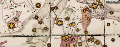
The buttons on the upper right give you the option to see infrared and microwave views, as well as overlaying a "historical" map from 1792 drawn by Giovanni Maria Cassini. The view below covers the same area as the one above.


You can zoom, pan and click on things as well as selecting views, galaxies, planets and constellations from a gallery at the bottom of the page. Here is a view of the Crab Nebula.


In addition to the sky, you can also Google Moon and Google Mars.
Here is a view of the moon with imagery, charts and Apollo Landings overlaid.


Here is what the topographic chart option looks like.


Finally, here is an elevation image from Google Mars.