Wednesday, December 30, 2009

Map of the Decade!

With grandiose visions of making a "Map of the Decade" I went and sought out some lists of the top news stories from the internet. Trying to find lists that were not biased by politics, region, or sector (such as technology) was impossible. The best I've come up with is this list from about.com. The list is biased towards the USA and our strategic interests and I have my own disagreements, notably the absence of China (big earthquake, rise as a superpower, hosting the Olympics) but I decided to map their list anyway.

Due to the limitations of the Blogger template you'll need to click on the map to see a readable version.


The background map is from MapQuest because they have the least annoying worldwide projection of the major mapping sites. I used the images from the about.com list though some of them are not very recognizable. I placed them at or near the approximate locations of each story except the global recession. That one got put on the Equator.

Yes the inclusion of Michael Jackson is ridiculous. Tell me something I don't already know! Like for example, what should be on this list instead. Have a happy new decade!

Thursday, December 24, 2009

NORAD Tracks Santa

Santa has begun his difficult journey delivering presents to the good boys and girls of a certain religion. You can follow his progress on Google Maps. Check soon before he takes his well deserved post-holiday break.


He's in Brisbane! Wait, now he's in Alice Springs! He's one fast fat guy!


Wednesday, December 16, 2009

Bruce, Bruce and Tom-A Musical Journey

I've always been interested in the geography of musicians-where they come from, where they get discovered, and where they choose to reside when success allows them that choice. I've found a few nice musician maps over the last couple of years. These three artists were chosen because someone made maps for them, more than for any personal preference.

Bruce Cockburn was born and raised near Ottawa but has spent most of his musical career in Toronto. He currently resides near Kingston, Ontario according to his web site. Here is a clickable map of his life in Toronto:


If you prefer the other Bruce, here is a map of  Springsteen's New Jersey titled "Bruceville." Bruce Springsteen is that rare musician who's never needed to stray too far from home and has always remained true to the Garden State.

This map is more fanciful than accurate. The only places that really seem to be located correctly are the Boardwalk, Highway 9 and his father's house. Little Eden is Millville? "The River" is the Delaware? "Tenth Avenue Freeze Out" is about Tom's River? * I have my doubts about these things. Thanks to Strange Maps for this.                                                        * After consulting Wikipedia, the undisputed source of all knowledge, it turns out the "Tenth Avenue Freeze Out" may actually refer to 10th Avenue in Belmar. If true then the map is close.

Shortly before his Super Bowl XLII appearance, LA Weekly published this map  of Tom Petty's Los Angeles by illustrator Scott Gursky. Although a native of Florida, Petty moved to LA at the beginning of his career and has remained in the area ever since. The article details each place on the map.


Wednesday, December 9, 2009

Map of the Week- Global Warming

It's snowing here in the northeastern USA so clearly global warming is a hoax! While climate change skeptics and their corporate sponsors continue to bury their heads in the sand, real scientists are gathered in Copenhagen for the United Nations Framework Convention on Climate Change. One of the primary goals is to try and limit the rise in temperatures. Britain's Met Office warned of a possible 4 degree Celsius rise in temperatures by 2060 in a study produced for the Department of Energy and Climate Change. The British government has produced an interactive map showing the impact of a 4C rise in global temperatures.


The circles represent hotspots for the categories listed at the bottom and can be turned on and off as well as clicked for more info.


Down at the bottom is a "credits" tab if you wish to investigate the data sources more closely.

Wednesday, December 2, 2009

The Lienzo de Quauhquechollan

A lienzo is a painting on cloth that was used by indigenous peoples in Central America to communicate knowledge.  The Lienzo de Quauhquechollan dating from the 1530's tells the story of how the Quauhquecholtecans of central Mexico allied with the Spanish conquistador Jorge de Alvarado to conquer Guatemala.  The painting forms a map showing the path of conquest with important rivers and towns represented as symbols.

The lienzo is kept in a museum in Puebla, Mexico. The Universidad Francisco Marroquin (UFM) in Guatemala City restored the painting in digital form and developed a web site to display the Lienzo interactively with a map, timeline, graphics and historical details. Clicking the Dynamic Web Map link will get you to the interactive experience. However, it will probably ask you to download Silverlight-Microsoft's new-ish web plugin that allows for smoother web browsing. This plugin is free, works in all major browsers and platforms (according to our Microsoft overlords) and should not affect anything else on your computer. It will take a few minutes for the process to run and another couple to load the page.

Here are some screen shots from the interactive map.


This shows the area around Retalhuleu, the first area the allies reached from Mexico. Notice the similarity of the dashed green line on the map above and the path of travel shown in the detail below.
 
Clicking on the red dots accesses information about the meaning of each area.
 
There are also pages that interpret the symbols, digital restoration information and lots of other good stuff on the web site.


Tuesday, November 24, 2009

Map of the Week- Lookout Mountain

On this day in 1863 Union and Confederate forces fought the Battle of Lookout Mountain. After losing a major battle at Chickamauga in September, Union forces gained control of this strategic overlook and the following day forced the Confederate troops off nearby Missionary Ridge. These battles enabled the Union Army to control most of Tennessee and set the stage for later campaigns in Georgia.


This battle and many others are nicely documented in maps for Wikipedia by amateur Civil War historian Hal Jesperson.


He also sells coffee mugs and t-shirts featuring his maps at Zazzle. Maybe someday he'll make a Lookout Mountain coffee mug that looks as nice as this one showing the Battle of Shiloh.

Wednesday, November 18, 2009

Map of the Week- Russia's Time Zones

President Dmitry Medvedev of Russia, in a recent speech, suggested reducing the number of time zones in Russia. A recent BBC article titled "Changing Times in Russia" highlights the difficulties of governing a country that has 11 time zones.


Businesses along the Amur River, across from China have a very short time window in which to be in contact with Moscow during normal working hours. Much of that region's economy has stronger economic ties to China, being closer not only geographically but temporally. The region could possibly improve ties to western Russia and Europe by changing their clocks to be in a closer time zone. 

China, despite spanning five time zones has adopted one time zone for the entire country. Taiwan, Hong Kong and Macau also use this same time zone. Russia is much too big and would more likely combine several of the time zones on the map above. The BBC article did not list any specifics from Medvedev 's speech but according to Georgian Daily he has proposed cutting the number of time zones to four.

Russia's 11 time zones are a source of pride for many, showing how large the country is and resistance to the plan is expected. A quote from a skeptical scholar of the plan via the Georgian Daily article:
Moscow can cut the number of time zones but it can’t change the shape of the earth or the speed of its rotation relative to the sun.
At least we hope they can't. They do have nukes!
Here is a list of the time zones:

Kalningrad:   UTC (aka GMT) + 2
Moscow:   UTC + 3
Samara:   UTC + 4
Yekaterinburg:   UTC + 5
Omsk:   UTC + 6
Krasnoyarsk:   UTC +7
Irkutsk:   UTC +8 - this is China's time zone
Yakutsk:   UTC +9
Vladivostok:   UTC +10
Magadan:   UTC +11
Kamchatka:   UTC + 12

Thursday, November 12, 2009

Map of the Week- Where was the Wall?

There's been much media coverage of the 20th anniversary of the fall of the Berlin Wall. One story I heard was about how some residents of Berlin no longer remember exactly where the wall was located. The German Senate has been working to preserve remnants of the wall and border fortifications. Berlin's official web site has a nice online map and guide showing the course of the wall and the associated monuments. This overview map allows the user to add artistic, memorial and historic sites and click on them for details.


 Below is a zoomed in view of the area around the Pariser Platz and Brandenburg Gate.


The web site also has aerial views, history, photos and tourist information.

There is also a 3D view although it requires the Google Earth plugin and does not allow for much interaction.


Here is an aerial view of the Checkpoint Charlie area combined with a map of that location.


The City has also constructed a hiking and bicycling trail along the 160 kilometers of the former border, most of it following the border control roads used by the two governments. The website has a nice description of each section of the trail and also has a link to the Mauer Guide, a downloadable GPS tour that traces the path of the wall with historical information. The guide can be loaded to a cell phone or other handheld device.

Happy 20 jahre mauerfall!

Wednesday, November 4, 2009

The Map as Art-Exhibit Opens Tomorrow

The Map as Art opens tomorrow at the Christopher Henry Gallery in New York City. This is a group show curated by Christopher Henry and Katharine Harmon, author of the really great map book "You Are Here: Personal Geographies and Other Maps of the Imagination." The show shares its name and accompanies the launch of Harmon's new book. There is an opening reception tomorrow (November 5th) from 6-9 PM.

The gallery is "conveniently located off the Elizabeth Street ramp of the Lower Manhattan Expressway" as illustrated below. Those of you in NYC might actually get the joke.


I did not get any images from the show other than what's on the gallery's site. Below is "Strike Anywhere" by Doug Beube.


Many artists are featured including Joyce Kozloff and Karey Kessler.

Here's a quote from the press release. I'm not sure how much I agree with it but it's an interesting take on mapping.

"In the guise of offering illumination, maps obscure. They purport to bring order to the fundamental chaos of life, promising clarity in the face of flux, and claiming knowledge of the unknowable. In their quest to demarcate our differences, they comfort us even as they give the lie to the notion of common experience."

Wednesday, October 28, 2009

Map of the Week- Pumpkins!

Denis Wood, an artist and cartographer has co-written several books on mapping, most notably "The Power of Maps" and "Making Maps." Since the 1970's he has been working on a "narrative atlas" of Boylan Heights, his neighborhood in Raleigh, North Carolina. While the atlas has not been published, there are excerpts on the "Making Maps" blog. One of the most well known of these is his jack-o-lantern map.

The map shows the locations of jack-o-lanterns using an image of each one. The lack of any other detail challenges the idea of this being a map. The author aims to break down boundaries between mapping and art and to focus on the patterns rather than on the specific locations that would be apparent if the streets were included.

Wednesday, October 21, 2009

There's a Map of the Week for That

OK - I screwed up this post a bit. I will leave the original post intact but see the correction section at the end.

Verizon has blitzed the TV and print media with their clever "There's a map for that" advertisements. Given the ease of manipulating this type of map, I'm surprised that this ad has gone virtually unchallenged so far. Does Verizon's map color in any area of reception regardless of how spotty? Are the map projections the same? Does the red vs blue scheme imply some kind of secret Republican bias on the part of Verizon?
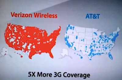
I wasted way too much time on a somewhat extensive web search and found nothing out there that challenges this ad. Here is a screenshot from the ad.


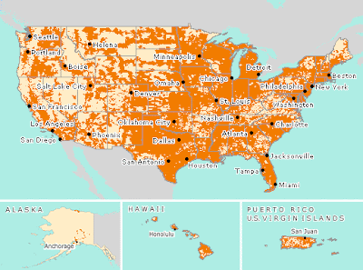
Here's a look at AT&T's "coverage viewer" map - it tells a slightly different story.


Both carriers, Verizon and AT&T have interactive coverage maps. You can zoom down to street level to see your local coverage. However, if you live in any urbanized area you're likely to see nothing but a sea of color. Both of these pages have very similar disclaimers. Here's part of AT&T's.
"Map may include areas served by unaffiliated carriers, and may depict their licensed area rather than an approximation of their coverage. Actual coverage area may differ substantially from map graphics, and coverage may be affected by such things as terrain, weather, foliage, buildings and other construction, signal strength, customer equipment and other factors. AT&T does not guarantee coverage"
Sounds like lots of gray areas that can go either way depending on whose map you're making.

The obvious lesson in all of this-don't believe everything you see in advertisements-or maps.

Or on this blog (See below)!!!!!


CORRECTION:
So, as anonymous commenter pointed out, the AT&T map I show above from their website is a "Voice & Data" map, not 3G. As are both of the coverage viewers that I linked to above. You can get a 3G map from AT&T but it's very tricky-if you really want it look for instructions in the comments. The map you will find is actually pretty similar to the map shown in the ad.

What's the difference? Is it just speed or are there things you can't do with "Voice & Data?" I don't know enough about this stuff to speculate.

So if I've unfairly portrayed Verizon as a bunch of liars, sorry about that. However, I am still very skeptical about their own coverage map and the entire premise of the ad. As the Verizon disclaimer says:

"This does not show exact coverage. Wireless service is subject to network and transmission limitations, particularly near boundaries and in remote areas"

If you want maps that are better than the blurry ones in the ads, see the Verizon 3G page.

Wednesday, October 14, 2009

It was 45 years ago today (last month)

At a yard sale in Pennsylvania we found a nice collection of vintage records and teen magazines from the 1960's. The sellers were big Beatles fans who saw them on tour and collected magazines that featured the band.

I picked up the October/November 1964 issue of "teen talk" for 50 cents. The original newsstand price was 35 cents. Issued on the eve of the first major U.S. Beatles tour*, there were lots of articles about the Fab Four and other British Invasion bands. Also included was a map of the tour.


* This magazine probably hit the stores well before October 1964 - the tour dates (August-September 1964) are mentioned in the future tense.

Thursday, October 8, 2009

Map of the Week- The Ski Train

We spent part of a rainy Adirondack Saturday at the North Creek Depot Museum. The museum has some Theodore Roosevelt history and lots of interesting ski industry relics including gondolas, tow lift ropes and skis. It also has a great model of the Upper Hudson River Railroad and, of course, maps. Here is a 1948 map of the trails from the depot to the slopes.

People would pay $2 to ride the Ski Train to North Creek. They could start skiing right from the depot or pay 50 cents for a truck or taxi ride up one of the slopes. Gore Mountain was not yet built as a ski resort so skiers used this network of trails, most of which have since been abandoned.
Unfortunately they did not have copies for sale so I only have this low resolution image courtesy of the Albany Times Union.

While digging around for that map I also found this statewide scenic railroad map online.

The nice thing is that they've brought together all the tourist railroads and museums onto one page and map. The map itself could use some work. For, one thing it would have been easy to make the cute railroad signs into links. The overemphasis on New York's tourist regions is also a bit distracting. Long Island is missing but if they don't have scenic railroads there then I can live with that. Some of the cities are poorly located and Troy is missing - that's just not right!

Wednesday, September 30, 2009

Map of the Week-Henry Hudson 400


The Henry Hudson 400 Foundation was founded to commemorate the 400th anniversary of Hudson's voyage to North America. He explored New York harbor and sailed up what is now the Hudson River hoping to find the northwest passage to the Pacific. Instead he found Albany.

The Foundation has put together a series of events including a rare maps and documents exhibit; New Amsterdam, The Island at the Center of the World at the South Street Seaport Museum. The exhibit opened September 13th and runs through the end of the year. They also have put together an excellent website with a series of antique maps and data overlaid onto Google's maps.


This map shows Hudson's four voyages. The third one, in dark green took place in 1609. He explored the North Atlantic coast as far south as the Chesapeake Bay. The fourth voyage made it as far as the Hudson and James Bays in 1611 before his crew killed him in a mutiny.


Historic maps can be overlaid with Google in several ways. This is a direct overlay of a 1625 map of Amsterdam by Balthasar. The background map only shows up because I made a screen capture before it finished loading the Balthasar map.

This 1731 James Lynne plan of lower Manhattan was overlaid using the transparency slider so you can see some of the Google map details in the background.

There is also a side-by-side viewing option as seen for the map "Novi Belgii Novaeque Angliae Nec Non Partis Virginiae Tabula"
by Nicolaes Janzsoon Visscher & Augustine Herman (1651 - 1655)


The site has an "Origins" tab where you can get information about the first kosher butcher or the area's first prostitute. There are also links to other maps around the world from this period of exploration shown under the somewhat confusing "Map Illustrations" heading. Finally, there are a series "Water Challenges" due to rising sea levels. Happy exploring!

Thursday, September 24, 2009

Map of the Week-Dust in the Wind

So Australia has this big dust storm that turns the sky orange, snarls traffic and causes health hazards and all I can think about is whether or not I can get a good map out of it. Truth is there are few maps to be had. The news sites are more interested in these remarkable pictures.


Seems to me that a map showing the extent of the storm, the damage, traffic tie-ups, anything would be very interesting but no such luck. After spending way too much time searching I finally turned to the trusty old BBC and found some decent maps.


This map shows extent of the storm as well as it's presumed origins at Lake Eyre Basin, a "dusty" area of desert in South Australia.


Most of the satellite images I've seen do not have places labeled, making it difficult to understand the scale of what you're looking at. The above image could be a couple of miles or several hundred miles. Thankfully the BBC came through again and put labels at Sydney and Brisbane, as well as a scale bar. Yes, we're seeing over a thousand miles of dust!

Wednesday, September 16, 2009

Map of the Week-Tasty Wine Maps

I don't know much about wine. My keen sense of taste tells me that some wines are "better" than others. I do know that my local liquor store is decorated with some nice, colorful maps including this one.

This map is huge and takes a long time to download so I only show a section of it above. It is available online here (click the "Quality Wines map" link) if you want to wait for it. The store also has nice regional maps of France, but I could not find those online. However, I did find lots of other maps. Here is a nice general map of France for people like me who only know the most basic distinctions.


Those with a keener palette may want to dig into a detailed region such as the Loire.

If you're planning some wine tourism you might want a detailed map like the one below of Madera, California. I mainly included this map because it is, in my cartographic opinion, cute. You might get lost if you actually try to use this map as its accuracy seems to get lost in all the cuteness.

L'Chaim!

Wednesday, September 9, 2009

Treasures from the DeLorme Store

Some nice maps are found in yard sales for pennies (previous post) but sometimes it's equally nice to browse through a map store and spend some money. A highlight of any trip to Maine is a visit to the DeLorme Map Store in Yarmouth. Not only does it have the world's largest rotating and revolving globe, it also has a great selection of maps and a budget bin full of surprises. I spent $42 and got lots of good stuff including:


Mount Washington trail map by The Wilderness Map Company. Nice clean lines and use of color. Printed on heavy stock to stand up to a snowy hike.

Afghanistan and Surrounding Territory by Oxford Cartographers. Includes all of Pakistan and Tajikistan. A good map to have with so much of this area in the news regularly.

Unfortunately the back side is blank - what a rip!

Miami Popout Map by Compass Maps. Yes popout maps are gimmicky and only show the touristy places but the cartography's well done and who doesn't like a good popout?


Oregon by Rand McNally. If you have the road atlas, then you have this map but it was in the budget bin and has some goofy tourist blurbs along with the city maps. I couldn't resist that. Who would have guessed that Salem has "governmental and agricultural activity"?


Map of Kennebec River trails (Augusta-Gardiner, Maine) produced for the Friends of the Kennebec River Rail Trail. This is a very attractive map/brochure with contributions from numerous conservation agencies. The detail above shows downtown Augusta.


Santa Monica Mountains - National Geographic's Trails Illustrated series. Printed on waterproof paper!

Santa Monica Pier from same map - Happy 100th birthday!